Paper Time Capsules: Deciphering the Codes of Postcard Typography
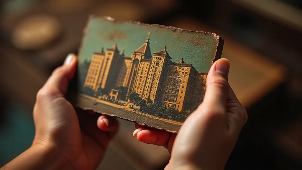
There’s a peculiar magic in holding a vintage postcard. It’s not merely a piece of cardboard; it’s a tiny window into a bygone era, a whispered message across decades. Many of us are drawn to the captivating imagery – the grand hotels, the sweeping landscapes, the bustling cityscapes. But beyond the photographs and illustrations lies another layer of enchantment: the typography. The fonts, the lettering styles, the very arrangement of words are more than just functional; they're visual clues, silent storytellers, and essential components of the postcard’s overall appeal. They're a secret language we can learn to decipher.
My own journey into the world of vintage postcards began with a box inherited from my grandmother. Nestled amongst faded photographs and dried flowers were hundreds of postcards, mostly travel souvenirs from her trips in the 1930s and 1940s. Initially, I was captivated by the scenes they depicted – the vibrancy of Coney Island, the grandeur of the Panama-Pacific International Exposition. But gradually, my attention shifted to the text. The way the names of cities and resorts were rendered, the playful curves of the fonts, the starkness of some of the block letters… it was a world unto itself.
The Dawn of Mass Communication & the Rise of Postcard Typography
The postcard itself is a relatively young invention. While picture postcards emerged in the late 1800s, the real explosion in popularity came with the introduction of the divided back in 1901 in the United States. Suddenly, personal messages could be written alongside the image, transforming the postcard from a simple souvenir into a miniature correspondence. This burgeoning medium demanded a visual language that was both eye-catching and easily legible. Early postcard typography reflects this need, often favoring bold, decorative fonts designed to stand out in a crowded marketplace. The rise of lithography also played a crucial role. Advances in printing technology allowed for increasingly complex and detailed designs, pushing the boundaries of what was possible in postcard typography.
Fonts of the Era: Echoes of Design Movements
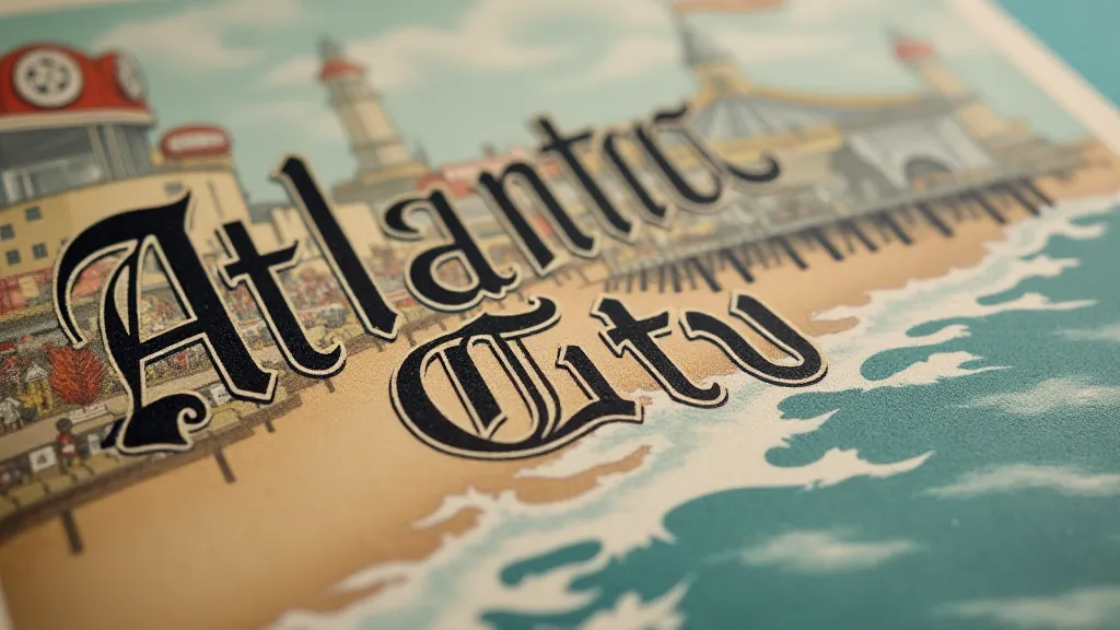
The fonts gracing vintage postcards weren't chosen at random. They were deeply influenced by the prevailing design trends of the time. The Edwardian era, with its emphasis on elegance and ornamentation, favored elaborate, flowing scripts and decorative serifs. Think of the curvaceous forms of Caslon or the whimsical flourishes of Shelley script. These fonts conveyed a sense of sophistication and refinement, perfectly suited for showcasing luxury resorts and idyllic landscapes. The Art Deco movement, sweeping across the 1920s and 1930s, brought a new aesthetic – streamlined, geometric, and modern. Fonts like Futura and Kabel reflect this shift, with their clean lines and angular shapes. They spoke of progress, innovation, and the excitement of the machine age.
Beyond simply reflecting the era, the fonts also served to evoke specific emotions. A cheerful, rounded font might be used to advertise a family-friendly destination, while a more formal and stately font might be employed for a grand hotel or historical landmark. The color of the ink also played a crucial role. Deep reds and blues conveyed a sense of importance and prestige, while brighter colors like yellow and green were used to create a more playful and inviting feel.
Craftsmanship & the Human Touch
What’s particularly endearing about vintage postcard typography isn’t just its aesthetic appeal, but also the evidence of human craftsmanship. Unlike the perfectly uniform fonts we’ve grown accustomed to today, vintage postcard lettering often bears the marks of the hand that created it. Slight imperfections in the lines, subtle variations in the spacing – these aren't flaws; they're signatures of an era when printing was still a more artisanal process. Looking closely, you can almost feel the presence of the engraver, painstakingly carving each letter into the printing plate.
This appreciation for craftsmanship extends beyond the fonts themselves. The overall layout of the postcard, the placement of the image and the text, the use of decorative borders – all these elements were carefully considered to create a visually harmonious whole. The best vintage postcards aren’t just pretty; they’re meticulously designed works of art.
Restoration and Preservation: Respecting the Past
As with any collectible, preserving vintage postcards requires a delicate balance between restoration and authenticity. While it’s tempting to clean and repair damaged postcards, it’s important to remember that these imperfections are part of their history. Excessive cleaning can remove the original patina, while aggressive repairs can obscure valuable details. The goal should be to stabilize the postcard and prevent further deterioration, rather than to restore it to a pristine condition.
Similarly, when assessing a vintage postcard's value, it’s important to consider the typography. A postcard with particularly striking or unusual fonts may be more desirable to collectors. Similarly, a postcard with a printing error, such as a misaligned font or a faded image, can sometimes increase its value as a rare and unique specimen. It’s about understanding the story the postcard tells, both visually and historically.
More Than Just Letters: A Window to the Soul
Collecting vintage postcards isn't just about accumulating pretty pictures; it's about connecting with the past, about understanding the lives and experiences of those who came before us. The typography on these postcards is more than just lettering; it's a visual code that unlocks a deeper understanding of the era, the culture, and the human spirit. Each font tells a story, each curve and line reveals a glimpse into a forgotten world.
My grandmother’s postcard collection, once a jumble of faded images and fragmented messages, has become a treasure trove of memories and insights. The careful choice of fonts, the meticulous layout – they are testaments to the artistry and craftsmanship of a bygone era. And in deciphering the codes of postcard typography, I’m not just learning about fonts; I’m uncovering a piece of history, one letter at a time.