Cartomania: Mapping Desire Through Antique Postcard Landscapes
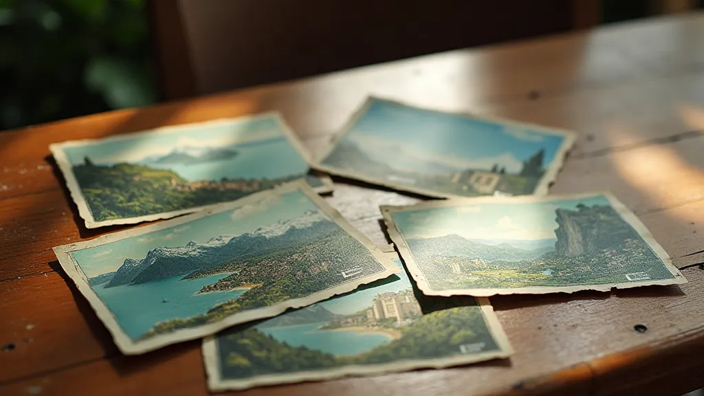
There's a quiet thrill, a tangible connection to the past, that washes over me when I hold a vintage postcard. It’s not just a piece of cardstock; it's a frozen moment, a whispered invitation from a bygone era. For those of us captivated by the world of antique postcards, particularly those depicting landscapes and travel scenes, it’s a window into a world relentlessly shaped by desire – a desire to see, to experience, to *be* somewhere else. My own fascination began with a faded postcard of the Grand Canyon, tucked inside my grandmother’s scrapbook. The image wasn't just a representation of the canyon; it was a promise of adventure, a doorway to a place I longed to know.
This isn't simply about collecting old pictures; it's about understanding the powerful role these small canvases played in shaping our perception of the world – and fueling a burgeoning tourism industry. The late 19th and early 20th centuries witnessed an explosion in postcard production, coinciding perfectly with the rise of mass travel and the romanticization of faraway places. Advances in printing technology, particularly chromolithography, allowed for vibrant, almost unbelievable depictions of landscapes, transforming ordinary places into idealized paradises.
The Art of the Fabrication: Idealized Landscapes
It's crucial to remember that these early postcards weren't intended as objective records. They were sales pitches. Locations were often *enhanced*, colors exaggerated, and details altered to appeal to a burgeoning tourist market. The idea wasn't to show reality but to offer an *aspirational* reality. Think about images of the Swiss Alps – perpetually snow-capped and bathed in golden light. Or the seemingly endless stretches of coastline in the Mediterranean, rendered in hues that would make any modern photographer envious. The postcards frequently omitted any blemishes – the industrial sprawl, the poverty, the harsh realities of daily life. They presented a carefully curated fantasy.
This manipulation wasn't necessarily malicious. It was simply the language of the time – a form of persuasive marketing designed to spark wanderlust. And it worked brilliantly. These postcards were often sent from travelers, sharing their experiences and subtly encouraging friends and family to follow suit. A postcard from a sun-drenched Italian Riviera might show a charming fishing village, prompting a reader back home to dream of escaping to a similar haven. The very act of sending a postcard became a form of travel endorsement, a silent promise of adventure. Sometimes, though, the very visual language employed spoke volumes— the careful choice of fonts and their arrangement conveying a sense of era and excitement, a language that contemporary collectors are now decoding to understand more about the moment they were created. Examining these nuances is, in essence, understanding postcard codes and typography.
Craftsmanship and the Details
Beyond the content, appreciating the craftsmanship of these postcards is a joy in itself. The lithographic process, while capable of producing dazzling colors, also required incredible skill and artistry. Printers worked meticulously, layering colors and painstakingly refining details. Look closely at a well-preserved postcard, and you'll notice the subtle nuances in shading, the delicate brushstrokes that mimic the play of light and shadow. Many were hand-tinted, adding another layer of artistry and individuality. These aren't mass-produced images; they're miniature works of art, reflecting the dedication of the artists and printers involved.
The postcards weren’t always pristine. Age and handling have taken their toll. Folds, creases, fading, and even water damage are common. Ironically, these imperfections often *add* to the charm and historical significance. They tell a story of their own – a journey through the mail, a life lived, a memory preserved. A slight stain from a spilled cup of tea might be a silent testament to a cozy afternoon spent reminiscing.
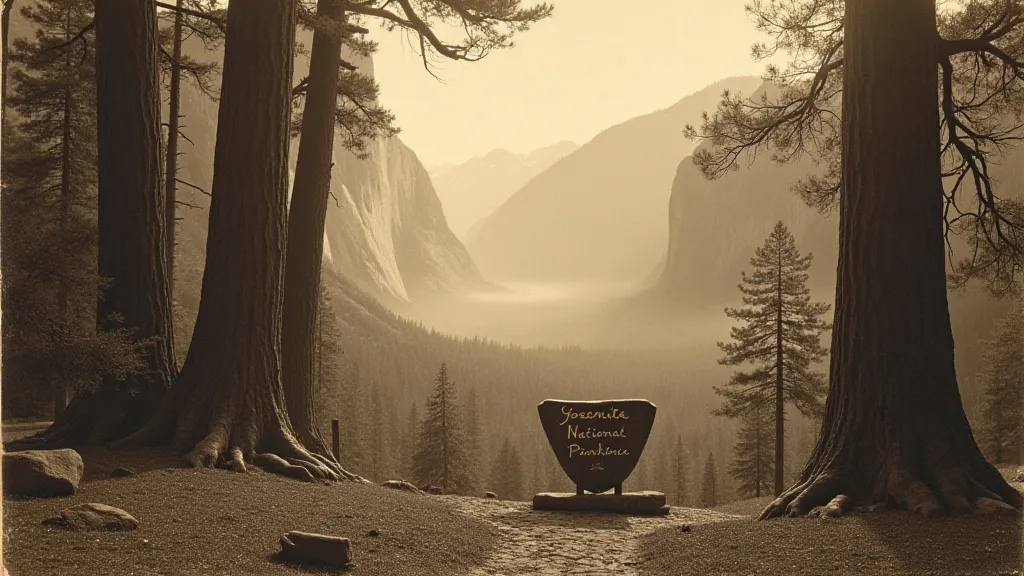
The Intersection of Cartography and Tourism
The rise of postcard tourism was intimately linked to the development of cartography. Early road maps and travel guides often featured images of key destinations, reinforcing the idealized visions presented on postcards. The maps themselves were often beautifully designed, incorporating artistic elements that enhanced their appeal. The combination of visual imagery and geographical information created a powerful package, further fueling the desire to explore.
Interestingly, the postcards themselves often served as rudimentary maps. While not precise geographically, they provided a visual guide to key landmarks and attractions. Travelers would send postcards to friends and family, inadvertently creating a network of personalized travel recommendations. This "word-of-mouth" marketing was invaluable to the burgeoning tourism industry. The very feeling of anticipation—that sense of the unknown—was often captured not just in the image itself but in the space left unwritten on the back, a silent invitation to imagine and dream. These blank spaces defining postcard memories held a unique power, contributing to the overall experience.
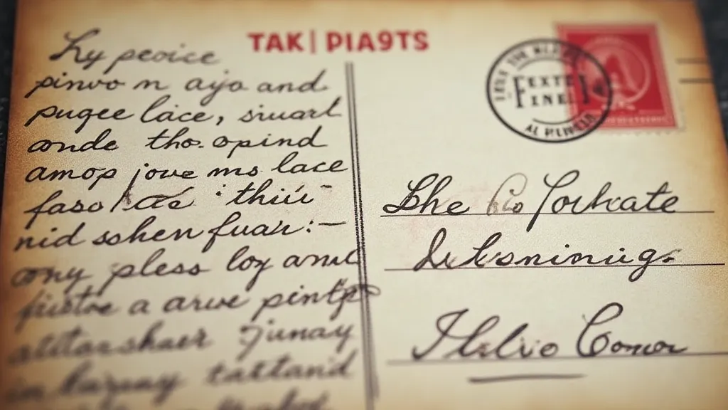
The Silent Storytellers: Unmailed Postcards and Lost Connections
While many postcards found their way into the hands of loved ones, a significant number never reached their intended recipients. These unsent messages, tucked away in albums and collections, offer a poignant glimpse into forgotten relationships and unrealized journeys. Examining these postcards—the words never spoken, the places never visited—provides a unique lens through which to understand the complexities of human connection and the bittersweet nature of longing. They whisper tales of missed opportunities and silent desires, adding another layer of depth to the world of vintage postcards. Imagine the story behind a postcard depicting a bustling Parisian street scene, addressed to a soldier stationed overseas, never sent due to circumstances unknown. The possibilities are endless, and each unsent card holds a piece of a lost narrative.
The Language of Color: Chromatic Palettes and Artistic Expression
The vibrant colors of vintage postcards weren't simply the result of technological advancements; they were a deliberate artistic choice. Early chromolithography allowed printers to reproduce a wide range of hues, and artists skillfully employed these colors to evoke specific emotions and create a sense of idealized beauty. The careful selection of color palettes—the interplay of blues and greens to represent tranquil seascapes, the use of warm oranges and yellows to convey the warmth of a tropical sunset—was a crucial element in the persuasive power of these postcards. Understanding the subtle nuances of these postcard color palettes provides insight into the artistic conventions of the era and the techniques used to create a sense of romantic allure.
Preserving a Fragment of Desire
Collecting vintage postcards isn't just about accumulating objects; it's about preserving a fragment of desire, a window into a bygone era when the world felt vast and full of possibilities. It’s about appreciating the artistry, the craftsmanship, and the historical context of these small pieces of cardstock. While restoration should be approached with caution—overly aggressive cleaning can damage the delicate printing—careful storage in acid-free sleeves can significantly extend their lifespan. The goal isn't to return them to a pristine state but to protect them for future generations to appreciate.
Each postcard holds a story, a silent invitation to escape and explore. And as I hold these fragments of the past in my hands, I can't help but feel a renewed sense of wanderlust – a desire to see the world, to experience its beauty, and to create my own stories to share.