Chromatic Ghosts: The Subtle Language of Postcard Color Palettes
There's a quiet magic in holding a vintage postcard. It's not just the thinness of the card stock, the brittle feel under your fingertips, or the faded image depicting a bygone era. It’s the colors. Or rather, the *absence* of vibrant hues, the deliberate restraint, the echo of an aesthetic sensibility lost to the relentless march of modern color saturation. Collecting vintage postcards, especially those focused on travel – a personal passion of mine – isn’t just about acquiring pretty pictures; it’s about deciphering a visual language, a language spoken in subtle shifts of chromas and tones, reflecting the artistic currents and technical limitations of the time.
My own journey into this world began with a postcard of the Grand Canyon, circa 1910. It wasn't the majesty of the canyon itself that drew me in, but the muted palette – dusty ochres, soft greys, and a surprisingly gentle sky. It felt…honest. In a world increasingly bombarded with digitally enhanced imagery, the postcard’s understated beauty offered a respite, a tangible connection to a time when truthfulness in representation felt paramount.
Early postcard production, primarily in the “Golden Age” between 1905 and 1915, was a fascinating blend of artistic ambition and industrial constraint. Color printing wasn't as simple as it is today. The dominant process was photolithography, and early color printing involved techniques like hand-tinting and the use of limited color separations. The number of colors a printer could reliably reproduce significantly impacted the aesthetic of the postcards. Think of it: no easy saturation sliders, no complex blending modes, just a skilled artisan meticulously applying color to a black and white photograph. This inherent limitation, rather than a hindrance, became a defining characteristic of the era’s postcard style.
The Era of Sepia and Hand-Tinting
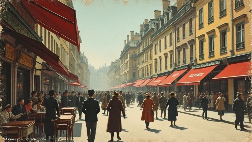
The earliest color postcards often relied heavily on sepia toning. This wasn't a conscious attempt to look “old”; sepia inks were often more stable and less prone to fading than early color dyes. The warm, earthy tones were perceived as aesthetically pleasing and conveyed a sense of timelessness, perfectly suited for depicting travel destinations meant to be treasured and shared. But as printing techniques advanced, so did the possibilities for color introduction.
The rise of hand-tinting marked a significant development. While photolithography handled the main photographic image, skilled artists would painstakingly add color by hand, using watercolors or other pigments. This allowed for a greater range of hues, though the quality varied depending on the artist's skill and the printer's budget. Notice how skies were often rendered in a particularly vibrant blue – often artificially intense compared to the rest of the image – a deliberate attempt to evoke a sense of idyllic beauty. The consistency of hand-tinting was, of course, a challenge, which is why you're more likely to find consistently colored postcards from a particular company or studio.
The Dawn of "Azo" Colors and Their Fleeting Beauty
The advent of “azo” dyes in the 1920s and 1930s represented another turning point. These synthetic dyes offered a wider and more intense spectrum of colors – brighter reds, yellows, and greens became readily available. Suddenly, postcards could boast of vibrant landscapes and striking portraits. However, this seemingly positive development came with a hidden cost. Azo dyes are notoriously unstable and prone to fading, particularly when exposed to light and humidity. This is why so many "bright" vintage postcards today appear significantly faded, their original brilliance lost to the relentless passage of time. These faded postcards aren't necessarily *less* valuable; in many ways, they hold a poignant beauty – a ghostly reminder of their former glory.
Color as a Cultural Signifier
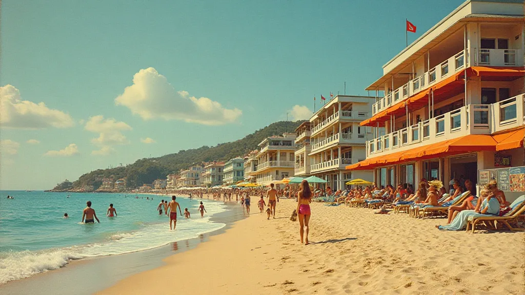
Beyond the technical aspects, color choices in vintage postcards reflected the prevailing cultural sensibilities of the era. In the early 20th century, a restrained palette was seen as a sign of sophistication and good taste. Excessive color was associated with lower classes and less refined aesthetics. Even the subjects depicted often influenced color choices. Pictures of burgeoning industrial centers might use muted grays and browns to convey a sense of stoicism and hard work, while depictions of leisure activities – vacations, seaside resorts – would often feature brighter, more optimistic hues.
Consider, too, the psychology of color. While the science of color psychology wasn’s as developed as it is today, there was an intuitive understanding of how different colors evoked certain emotions. Blues and greens were associated with tranquility and nature, while reds and yellows were used to convey excitement and energy. These subtle nuances are often overlooked by casual observers, but they provide valuable insights into the cultural context of the postcard.
Preserving the Chromatic Ghosts: Restoration & Collecting
For the avid collector, understanding the color palettes of vintage postcards is crucial for identifying authentic pieces and assessing their condition. Fading, discoloration, and even staining are common problems, but knowing the *original* color scheme can help determine the extent of the damage and whether restoration is warranted. While digital restoration can sometimes be employed to enhance faded colors, it's important to proceed with caution, as excessive manipulation can diminish the postcard's historical integrity. Often, appreciating the faded beauty – the "chromatic ghosts" – is more rewarding than attempting a perfect restoration.
When collecting, focus on the details. Examine the paper stock, the printing technique, and, of course, the colors. Research the printer’s marks and the artist’s signature (if present). Become familiar with the common color palettes of different eras and regions. And most importantly, take the time to appreciate the stories these postcards tell – not just about the places they depict, but about the people who created them and the era they represent.
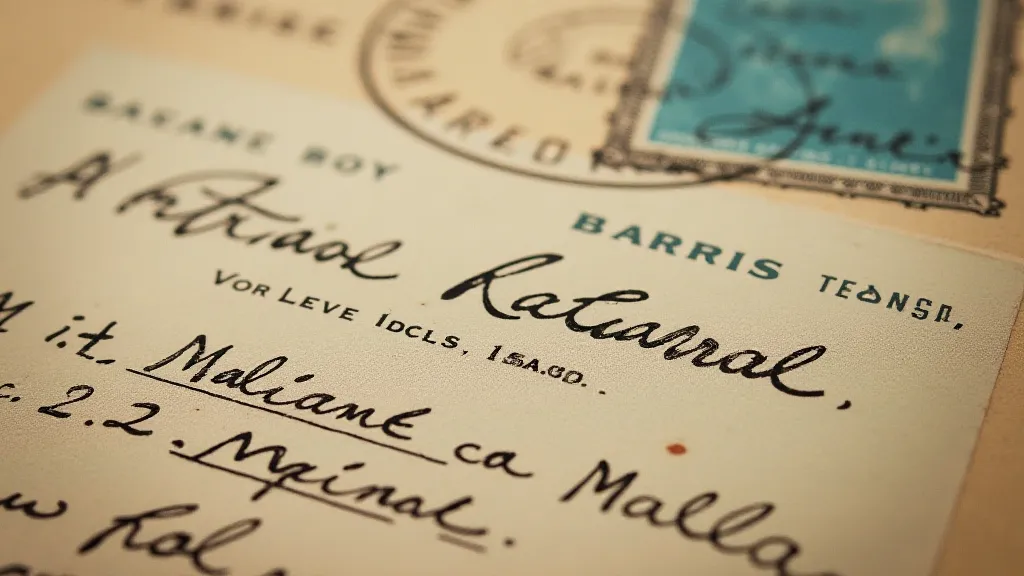
Collecting vintage postcards isn’t simply an acquisition of objects; it's an act of preservation, a way to connect with the past and to appreciate the beauty of a bygone era. And by understanding the subtle language of color palettes, we can unlock a deeper appreciation for these fragile, fleeting glimpses into history – the chromatic ghosts whispering tales from a world long gone.
