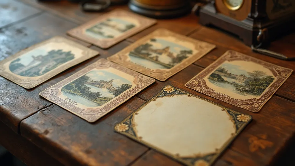
The Language of Framing: How Postcard Borders Shape Perception
There's a quiet poetry to vintage postcards. It's not just about the scenes they capture – the bustling boardwalks, the towering mountains, the quaint storefronts – but also, and perhaps more subtly, about the frames that enclose them. These borders, often overlooked, are a surprisingly eloquent language, silently guiding our gaze and subtly influencing our interpretation of the view. Collecting vintage postcards, particularly those with distinctive or unusual borders, offers a window into the visual culture of a bygone era, a chance to decode the unspoken instructions given to the viewer. It's a conversation across time, whispered in ink and paper.
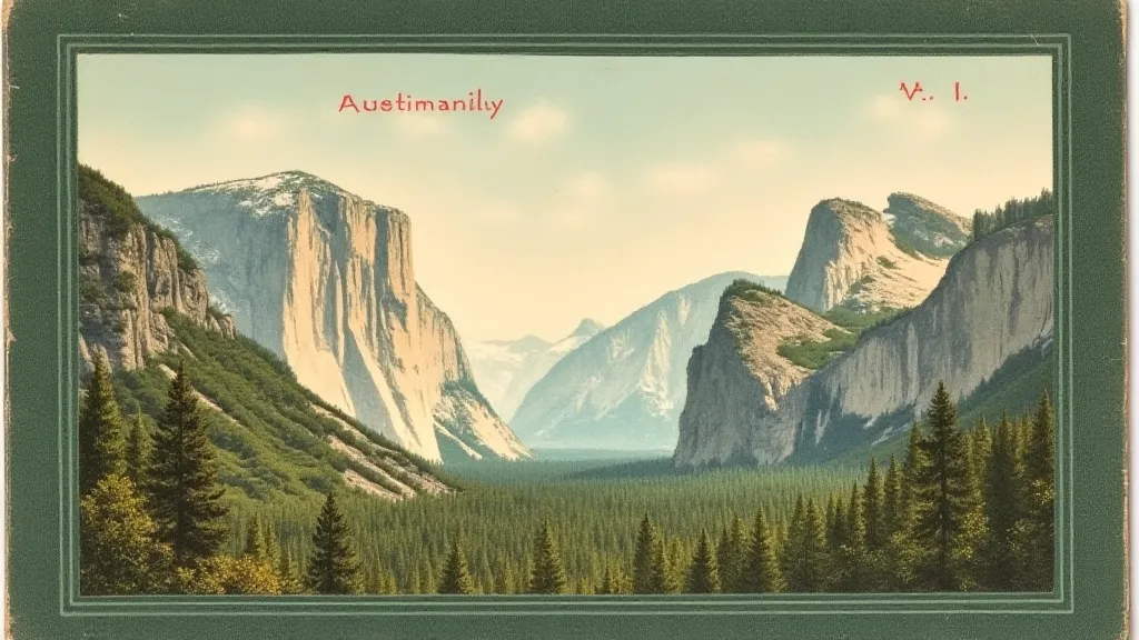
My own fascination with postcard borders began, innocently enough, with a small collection of early 20th-century travel postcards depicting the Black Hills of South Dakota. The images themselves were charming – scenes of Deadwood, Mount Rushmore in its nascent stages, and the Badlands’ raw beauty. But it wasn’t until I started noticing the differences in their borders that I realized the depth of their visual storytelling. Some were simple, understated lines; others were elaborately ornamented with intricate patterns and symbolic motifs. It was like discovering a secret code, a silent guide to how the publisher *wanted* you to see the scene.
The Rise of the Postcard & the Art of the Border
The “golden age” of postcards, roughly from the turn of the century until the 1930s, coincided with a period of rapid technological advancement and burgeoning mass tourism. The invention of chromolithography allowed for the mass production of colorful images, transforming postcards from simple communication tools into miniature works of art. The rising middle class, with increasing leisure time and disposable income, embraced postcard collecting and sending as a popular pastime. Publishers, recognizing the commercial potential, experimented with various design elements, including, critically, the borders.
Early postcard borders were often quite straightforward: simple rules lines, occasionally adorned with a single, repetitive decorative element. These borders served primarily to define the image and create a sense of order. But as printing techniques improved and competition intensified, publishers began to incorporate increasingly elaborate and sophisticated designs. We see a reflection of Art Nouveau’s flowing lines, the geometric precision of Art Deco, and even echoes of Victorian ornamentation. Each style contributed to the overall aesthetic, carefully curated to appeal to a specific audience. These weren’t just decoration; they were branding, and more than that, they were a form of visual persuasion.
Decoding the Motifs: What Borders Were Trying to Tell Us
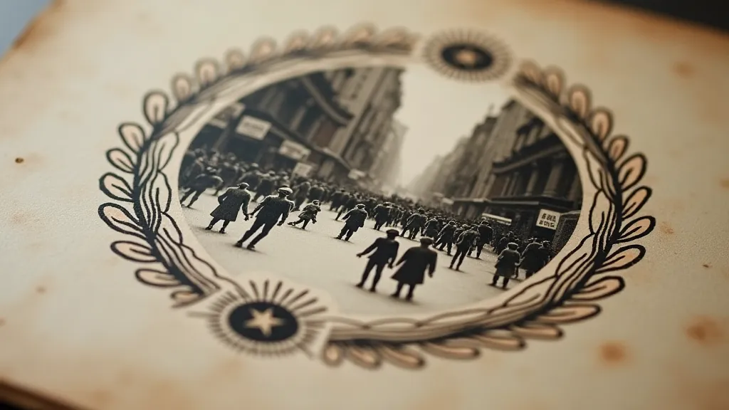
The motifs found on postcard borders weren’t arbitrary. They were carefully chosen to evoke specific emotions and associations. Seascapes, of course, were common for coastal destinations, reinforcing the feeling of being near the ocean. Mountain scenes often incorporated pine trees and eagles, symbolizing strength and majesty. Floral borders, particularly those featuring roses or lilies, added a touch of elegance and romance. Look closely at a collection of postcards from a specific region or era, and you’re likely to notice recurring patterns that reflect local culture and artistic trends. Consider how these depictions often created a desired narrative – a carefully crafted illusion of a place or time.
Beyond these general trends, subtle variations in border design can offer invaluable clues about a postcard's origin and intended audience. A postcard advertising a luxury resort might feature a gilded border and ornate lettering, while a postcard aimed at a more budget-conscious traveler might have a simpler, more utilitarian design. Even the thickness of the border line itself can be significant – a thick border can convey a sense of strength and stability, while a thin border can suggest delicacy and refinement. The power of suggestion wasn't lost on publishers; they understood the subtle art of shaping perceptions. Sometimes, the very absence of a prominent border – a minimalist design – could speak volumes about a postcard’s intended message. It's a testament to the thoughtful construction behind seemingly simple artifacts.
Consider the use of color. Early postcards often relied on limited color palettes, but as printing technology advanced, publishers began to incorporate a wider range of hues. Bright, vibrant colors were used to attract attention and create a sense of excitement, while more muted tones were used to evoke a feeling of tranquility and nostalgia. The careful selection of color was another powerful tool in the publisher's arsenal, subtly shaping the viewer's emotional response to the scene. Many early postcards sought to capture a sense of romanticized nostalgia, and that yearning often found expression in the subtle use of faded hues and deliberately distressed appearances. These choices reveal more than just technical limitations; they showcase a deliberate strategy for appealing to emotions and triggering memories.
The concept of “mapping desire,” as explored in detail in articles like Cartomania: Mapping Desire Through Antique Postcard Landscapes, is particularly relevant here. Postcards weren't simply documenting places; they were selling dreams – aspirations for travel, adventure, and a different way of life. These desires were expertly conveyed not just through the image itself, but also through the visual framing that enveloped it.
Restoration & Respecting the Frame
For collectors, the integrity of the border is paramount. Damage to the border – tears, creases, fading – detracts from the postcard’s value and historical significance. While some restoration is sometimes necessary to preserve fragile postcards, it's important to proceed with caution and avoid any interventions that could alter the original design. Cleaning dust and surface grime is generally safe, but attempts to repaint or recreate damaged sections are best left to experienced conservators.
The beauty of these vintage postcards, particularly the ones with elaborate borders, isn't just in the image itself; it's in the *whole package*. The border acts as a visual frame, guiding the eye and reinforcing the overall message. A torn or faded border diminishes the impact of the scene, disrupting the carefully orchestrated visual experience.
More Than Just Decoration: A Window to the Past
Collecting vintage postcards isn't just about acquiring pretty pictures; it's about connecting with the past in a tangible way. The borders, often overlooked, are an integral part of that experience. They offer a fascinating glimpse into the visual culture of a bygone era, revealing the artistic trends, advertising techniques, and cultural values that shaped the world of our ancestors. They are a subtle, yet powerful reminder that even the smallest details can tell a profound story. The deliberate use of blank space, or "the luster of absence," can be just as evocative as a densely decorated border, contributing to a sense of mystery and intrigue. This concept is further elaborated in The Luster of Absence: How Blank Spaces Define Postcard Memories, which provides a deeper understanding of how emptiness can communicate volumes.
I recently acquired a postcard of a small-town bakery, dated 1918. The border was remarkably simple - a rope design, almost childlike in its execution. But looking at it, I felt a sudden surge of empathy for the people who sent and received it. It wasn’t just a picture of bread; it was a connection across a century, a silent message of comfort and familiarity amidst the upheaval of wartime.
The ways in which postcard publishers constructed narratives about landscape and industry are particularly interesting. Often, they aimed to present an idealized view, omitting unpleasant realities and focusing on positive aspects. This construction of visual narratives speaks to broader trends in advertising and propaganda, where the goal was to shape public perception and promote specific agendas. Furthermore, the way that the postcards portray industrial landscapes is particularly revealing of the social and economic values of the time, as examined in Beyond the Beach: The Postcard’s Representation of Industrial Landscapes.
The thematic recurrence of certain motifs across decades of postcard production reveals a fascinating continuity of cultural references and artistic influences. Studying these patterns allows us to trace the evolution of visual language and understand how artists and designers responded to changing social and technological conditions. This concept of tracing common themes across time, analyzing the subtle shifts and reinterpretations, is explored further in Paper Constellations: Tracing Themes Across a Century of Postcard Production.
The impact of these postcards extends beyond mere historical documentation. They have the power to evoke powerful emotions, trigger vivid memories, and connect us to a shared human experience. They are tangible links to a past that continues to shape our present.
Ultimately, appreciating the language of framing in vintage postcards requires more than just a casual glance. It demands a willingness to delve deeper, to consider the context, and to recognize the artistry that lies beneath the surface. By paying attention to these often-overlooked details, we can unlock a richer and more nuanced understanding of the past.